Purple & orange is not an obvious colour combo but the mix of the deep purple and warm orange makes for a beautiful colour contrast. Purple promotes peace of mind, harmony of emotions and contributes to stability while orange radiates warmth and happiness.

You can find the colours purple and orange in our Tribal Sunset fabric. If want you fabric colours to be perfect, no problems. We offer colour matching services. We can either colour match to provided Pantone colour or physical swatch.
Find more color inspiration on the Digital Fabrics Pinterest page
Curious on what coral can do for your mood? Coral represents positive life force, energizing, flexibility and desire. Colours can communicate so much and instantly set a mood, generate an emotion and inspire people to take action.
Coral is also the main colour in our latest addition to the fabric shop called
Coral in the Clouds. And with the different fabric options available at Digital Fabrics, this beautiful fabric can be used both for your next sewing project, swimwear or home decor ideas.
If want you fabric colours to be perfect, no problems. We offer colour matching services. We can either colour match to provided Pantone colour or physical swatch.
What does coral inspire in you?

Once upon a night surfing on Pinterest we spotted one of Australian Artist Lisa Madigan artworks and after seeing her other work we knew we wanted to share her beautiful art.
Madigans artwork’s are filled with emotion, texture and so much beauty.


Images from LisaMadigan.com.auhttps://www.digitalfabrics.com.au/lisa-madigan-australian-artist/

This months colour inspiration is all about the colours of summer
Image source: Gray Malin, Au Jour Le Jour SS15, DF_1026, DF_0124
Colour trend colours of summer

This Months colour picks have been inspired by the blue shades of Glaciers
Image source:Kate Friend, Erdem Resort 2013, DF111, DF104 (to view our print collection please contact us through our website)

This Months colour picks have been inspired by vibrant summer salads
Image source: Nicole Franzen Photography, Sophia Bush wearing Monique Lhuillier, DF107, DF100 (to view our print collection please contact us through our website)

This Months colour pick have been deliciously selected, pastel candy colours reminding us of hot summer days and being refreshed by delicious sorbets.
Image source: earrings Kendra Scott, pineapple, DF_066, Bikes, DF_085

This months colour trends are all things pastels and blush.
These colour’s leave us dreaming of a love filled spring, which should be around the corner.
Image source: Ziadnakad.com, Eleleturkey.com, DF062CW1peony lace by Digital Fabrics, DF052CW1Open bloom by Digital Fabrics
There is a defined thought of summer in our minds, as we get shivering all day long in our studio. But in dreams of heat, before it gets too hot and sticky, we want to give an admiration to this season with these cool tones.


Who knows we might be back to these colours in coming summer, to cool ourselves down.
We do our fair share of colour matching here at Digital fabrics, Clients either mail us colour samples or give us Pantone PMS colours to work off. Colour is a big deal in the printing world; a logo must be printing in the same colour every time to be consistent with the company image. Colour has become more and more important to companies, some of who trademark their signature colour-think tiffany and Christian Louboutin.
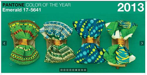
This year pantone released its colour of the year which was Emerald, this is not to say that everyone will be making things Emerald; it’s just a colour Pantone chooses to represent the year.

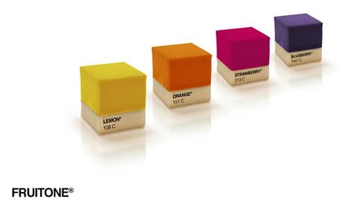
In further research on the topic colour, Pantone colours have been popping up in various other industries.For one delicious industry it has appeared in the form of cakes, confectionery artisans Miguel Angel Señorís and Manolo Angresola along with designer Ana Yago, creative director of Sanserif Creatius, are the ones to thank for these aesthetically pleasing, outfit matching works of edible art.

fruitone colour becomes edible pantone
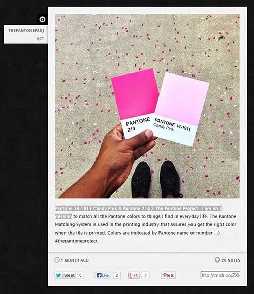
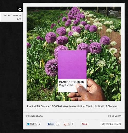
Another Pantone related article that has also caught my eye is the Pantone Project by Photographer Paul Octavious; Octavious has set out on a mission to match Pantone colours to things we find in everyday life. In a project he is updating on Tumblr, we are taken into Octavious’ surroundings and shown that colour is everywhere.

Paul Octavious Tumblr

Paul Octavious bright violet
If you are in need of colour matching, contact us through our website.
Images from http://www.swide.com, http://pauloctavious.tumblr.com/, http://au.pantone.com/pages/index.aspx?pg=21055


