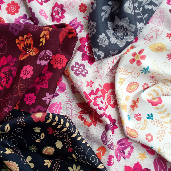
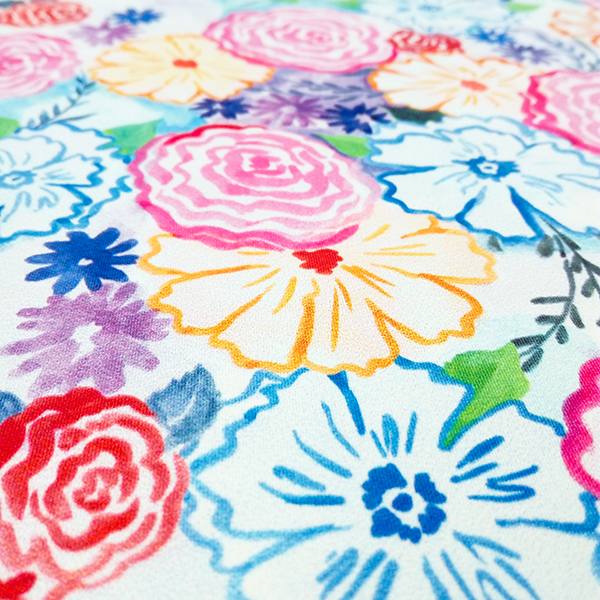
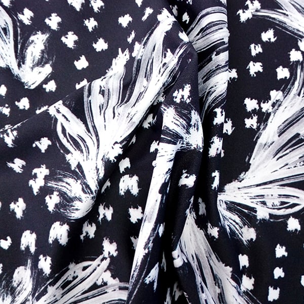
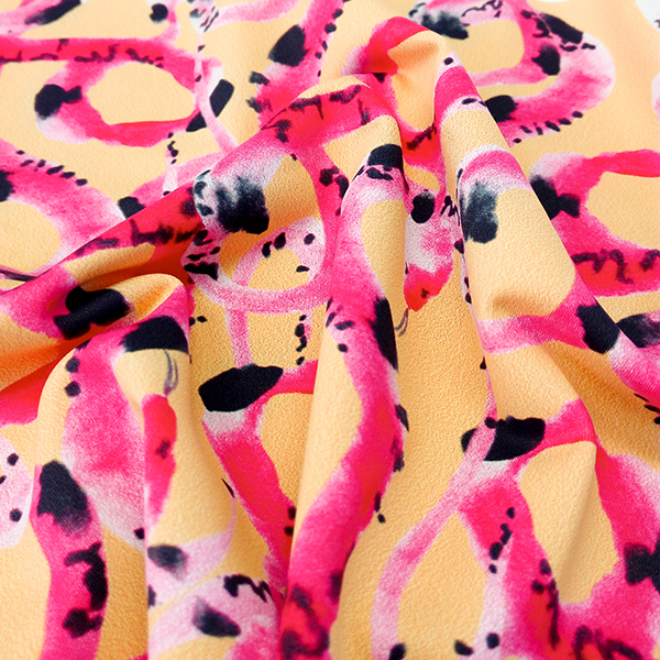
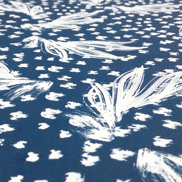
To conclude the summer season, we’re celebrating with our brand new Cup of Honey Fabric Collection. Showcasing a range of fun designs, it’s sure to inspire some DIY projects that are as sweet as honey!
We’ve drawn our inspiration from the idea of a sweet summer picnic for this collection! The process began by hand painting a variety of elements using watercolours, these were then scanned and arranged into these wonderful designs using Photoshop. To help ensure the collection was versatile, we chose to use a different scale for each design. When playing around with the colour palette, we found that the pink and green tones were an excellent combination and the touch of yellow added a radiant pop!
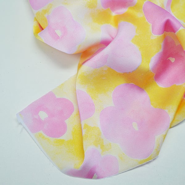
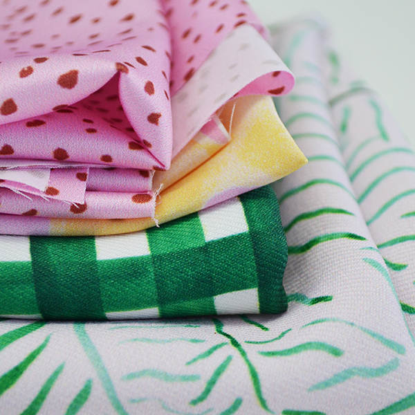
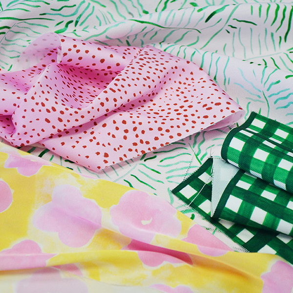
Our first design is Dilly Daisy. It features delightful pink florals against a sunny yellow background. The bright colour palette, mixed with the lovely watercolour textures has SUMMER written all over it!

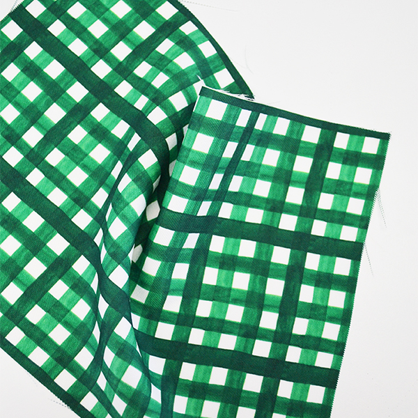
Next up is our Picnic. A playful gingham print that features a striking vibrant green hue. This design is absolutely fabulous and will easily remind you of a fun picnic rug!

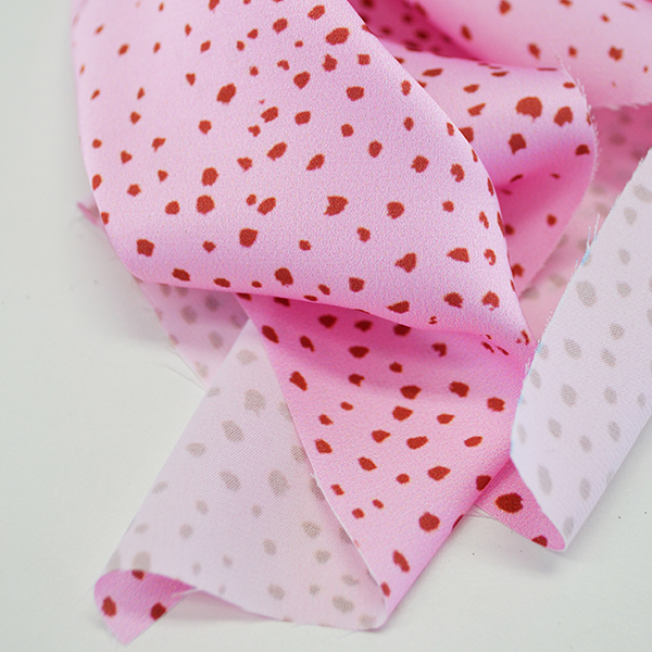
Our third design is Spell. Our charming Spell features a delicate pink and red bark speckled pattern, which could be used for a range of different products.

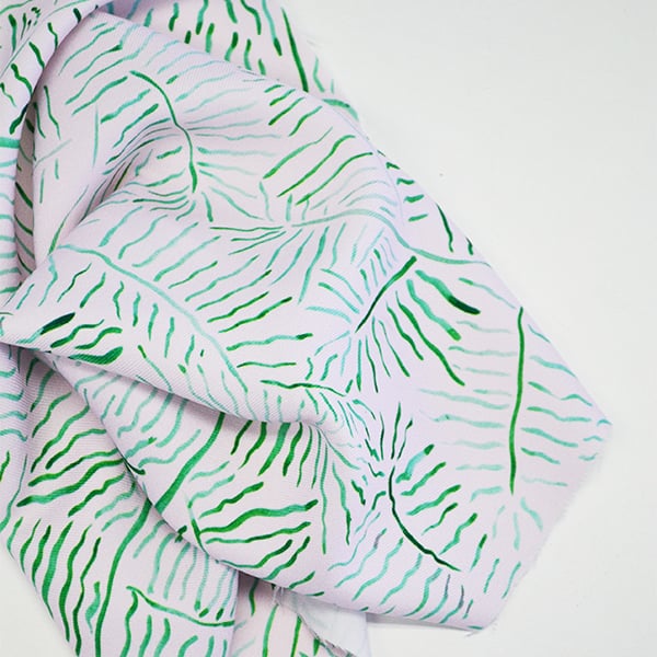
Finally, we have our Fern. This tropical feeling design featuring beautiful green watercolour textures on a soft pink background. It’s sure to bring back vacation memories!

We think the designs can be used for a variety of products and garments such as blouses, skirts, swimwear and bedding. The bright colour palette is sure to keep you feeling sunny during the colder seasons and will keep you inspired with whatever you choose to create with them.


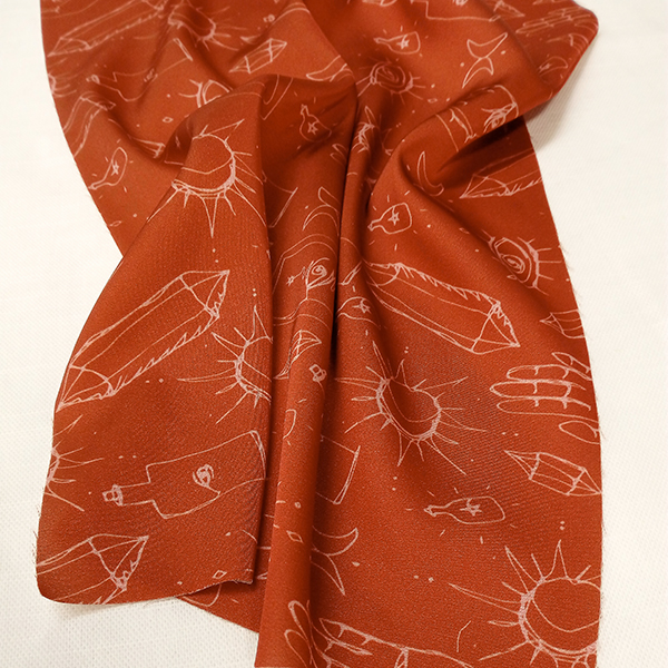
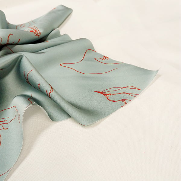
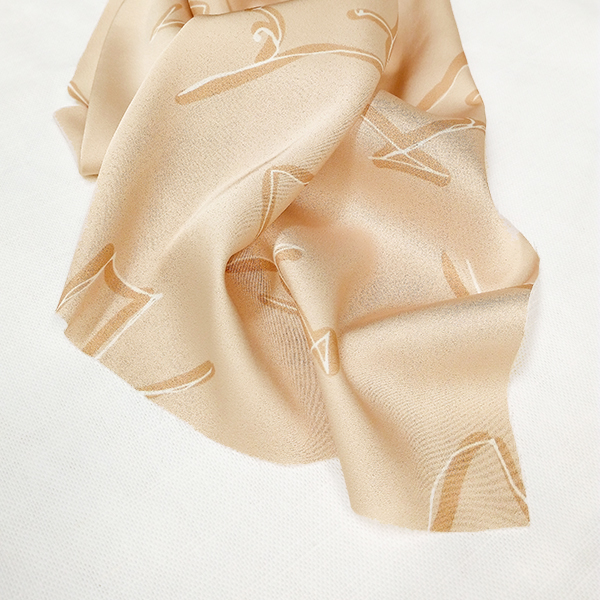
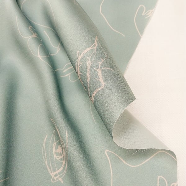
It’s that time again! Our design team has been busy at work to deliver you a brand new range of elegant designs. We’ve chosen to create seasonal feeling prints, contrasting in style to our previous floral filled collection, and guaranteed to inspire. Introducing our new Ella Collection, which is available now in our Fabric Shop now!

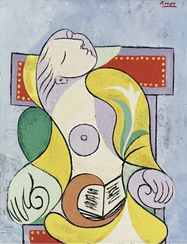
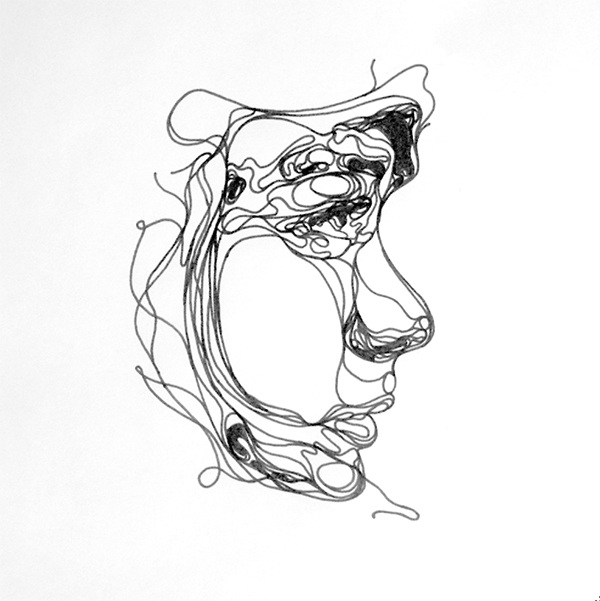
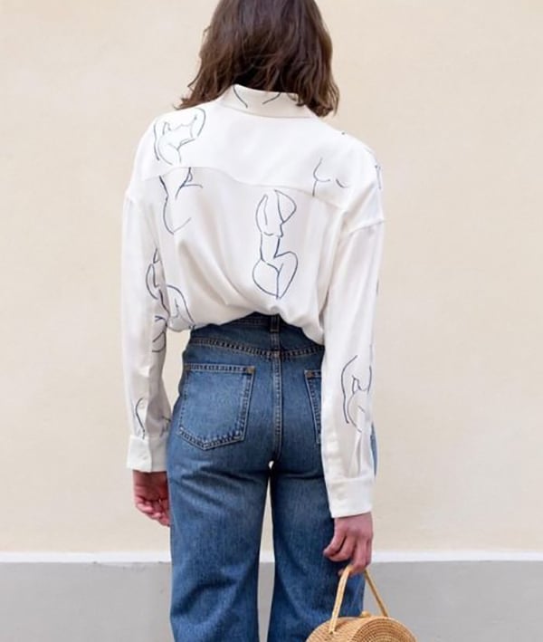
For this collection we were inspired by continuous line drawings which sparked the creative process of creating gorgeous, minimal designs. We took inspiration from the Divine Feminine, researching the female form, facial features and bohemian iconography. Picasso and artist Kris Trappeniers were also used as a reference to help guide the illustrative style of the collection. We then began to hand-draw a range of illustrations, experimenting with different pencils and markers before settling on the use of a black fine-line marker, to create a universal look to all the designs.
 Picasso
 Kris Trappeniers
Once we had a series of illustrations, we selected the drawings we wanted to use for the designs and scanned them for further development. Both Adobe Illustrator and Adobe Photoshop were used to clean the hand-drawn artwork and experiment with scale and layout.


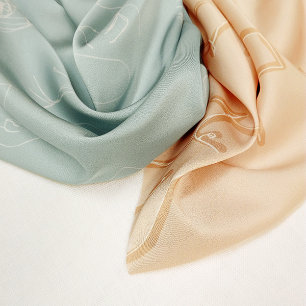
Different colours and tones were tested during the creative process for each design. Before we settled on a soft, earthy colour palette to compliment the feminine nature and simple elements of the collection. The warm colours, inspired by nature, create a harmonious flow throughout the range. For one of the designs we found two different colourways worked particularly well, and decided to feature both of them in the final collection.


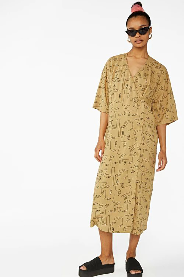
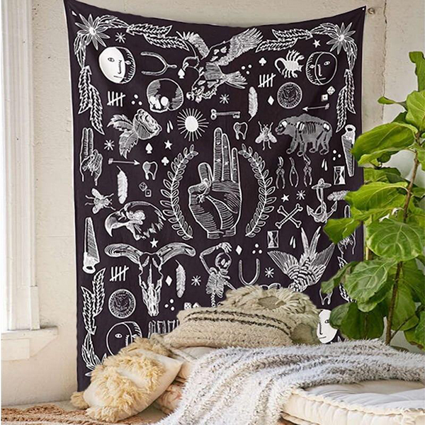
The prints include various scales throughout the collection which we think are perfectly suited to fashion applications. The minimalist artwork and diverse colour palette makes them incredibly versatile for a wide range of creative projects. We’ve included some reference imagery below to help get those ideas flowing.
 Image via Pinterest

Image via Pinterest
 Image via Pinterest
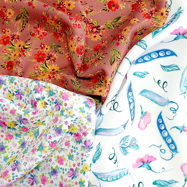
Spring is finally in bloom! As we have officially headed into the warmer seasons, we’re celebrating with our brand new Prairie Collection. Packed full of beautiful floral designs, it’s sure to inspire some DIY projects for Spring!
We’ve drawn our inspiration from the beauty of nature’s botanics for this collection, showcasing a range of dainty floral designs. The process began by hand-drawing and painting individual floral elements, which were then scanned and arranged into a variety of designs using Photoshop. A small scale was chosen for each of the designs to create a range of florals that were delicate and pretty. To ensure the collection was versatile we wanted to use a diverse colour palette. Cool and warm hues are used through the range which has a distinctly retro feel.

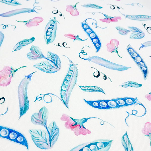
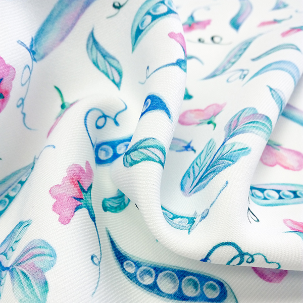
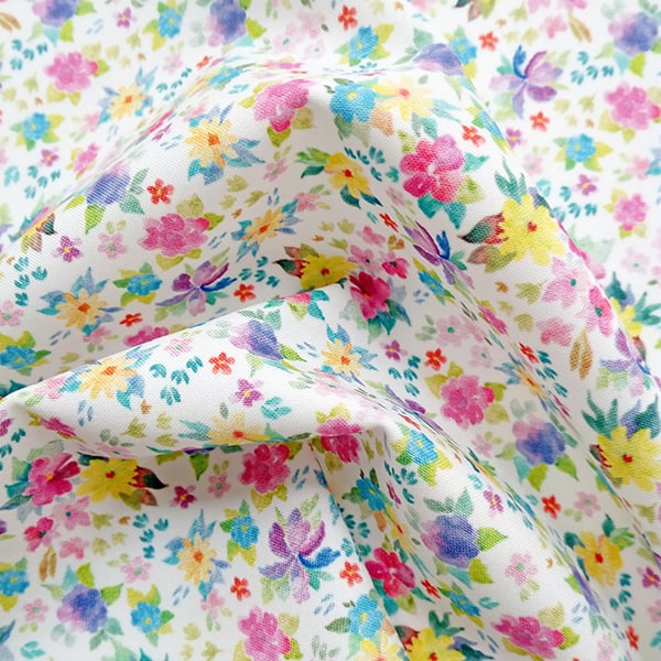
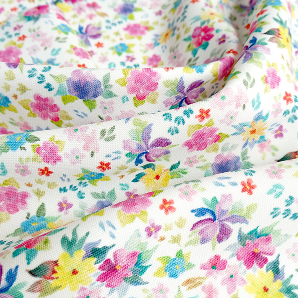
Our first design of the collection is Sweet Pea. It features soft, floral elements with an adornment of pea pods scattered throughout the design. The cool-toned colour palette gives this print a whimsical touch.


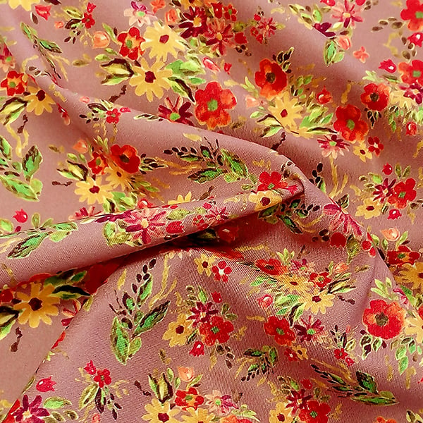
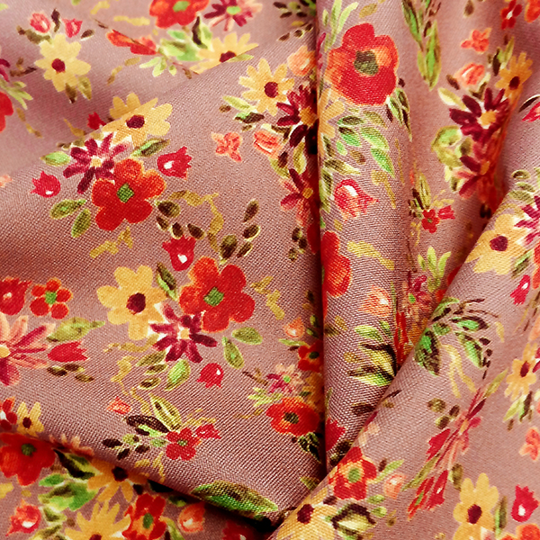
Next up we have Ginger Snap! This delightfully warm floral print is bursting with a bold, earthy glow. The detailed watercolour design and homely colour palette gives this print an inviting vintage feel.


Finally we have Posy! Our gorgeous Posy print features a mix of classic florals and soft watercolours, to create a design that is charmingly familiar.


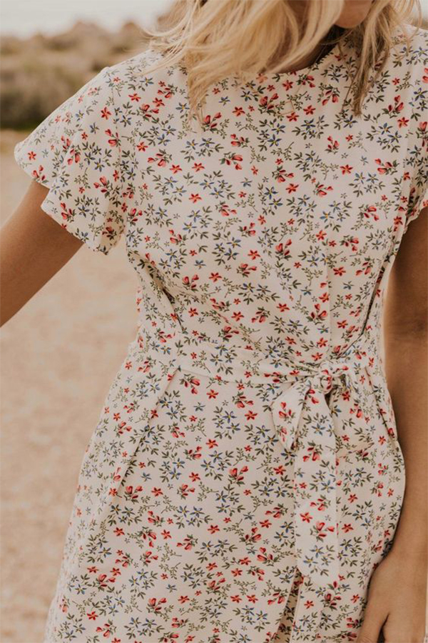
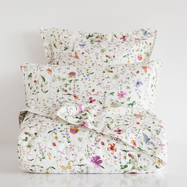
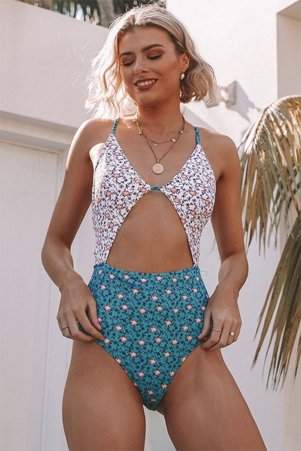
We think the designs can be used for a variety of products and garments such as blouses, skirts, swimwear and bedding. The bright yet soft colours of the designs, compliment the season perfectly and will keep you inspired with whatever you choose to create with them. We’ve included some reference imagery to showcase the many ways you could use these designs this Spring!
 Image via Pinterest
 Image via Pinterest
 Image via Pinterest
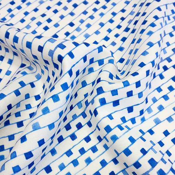
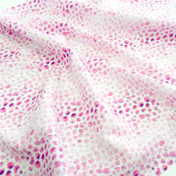
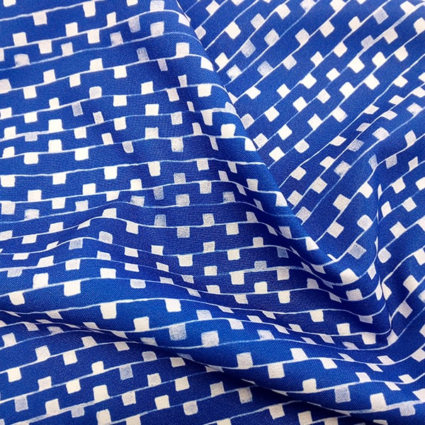
August is almost over which means Spring is upon us – and we’ve got longer days and warmer weather on the brain! What better way to get excited for the change of season than launching a brand new collection that celebrates salty hair and sun-kissed skin. Better schedule some time off because we’re taking you on a trip with our Adriatic Collection!


We were inspired by Ditsy prints for this collection and wanted to reinterpret the style with a more geometric and minimal approach rather than using pretty floral motifs. The process began by hand drawing and painting simple shapes and lines at a really small scale.
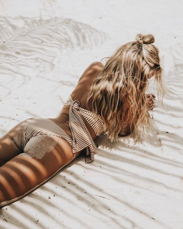
The graphic style of the elements which began to emerge pushed this collection into the space of fashion, particularly beachwear. The small scale of the motifs were perfectly suited to the intimate sizing of swimwear garments and has shaped the narrative behind this collection.


We chose to work with a minimal colour palette which compliments both the refined designs chosen as well as the laid back simplicity of being on vacation. Crisp whites are as much of a focus in this collection as the playful reworking of primary colours. The Adriatic Collection whisks you away with its nods to nautical design and use of timeless colour pairings evoking the sun and sea. We’ve included some reference imagery below to help get those creative juices flowing!
 Image via Pinterest

Image via Pinterest

Image via Pinterest
Whilst we feel the Adriatic Collection is perfect for Summer fashion, there are no limits to how these designs can be used and we would love to know what you think they would be perfect for – so get in touch! The complete range is available in our Fabric Shop now. We hope you are as inspired by it as we are!
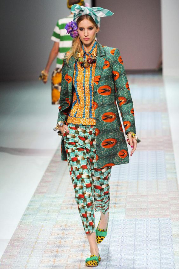
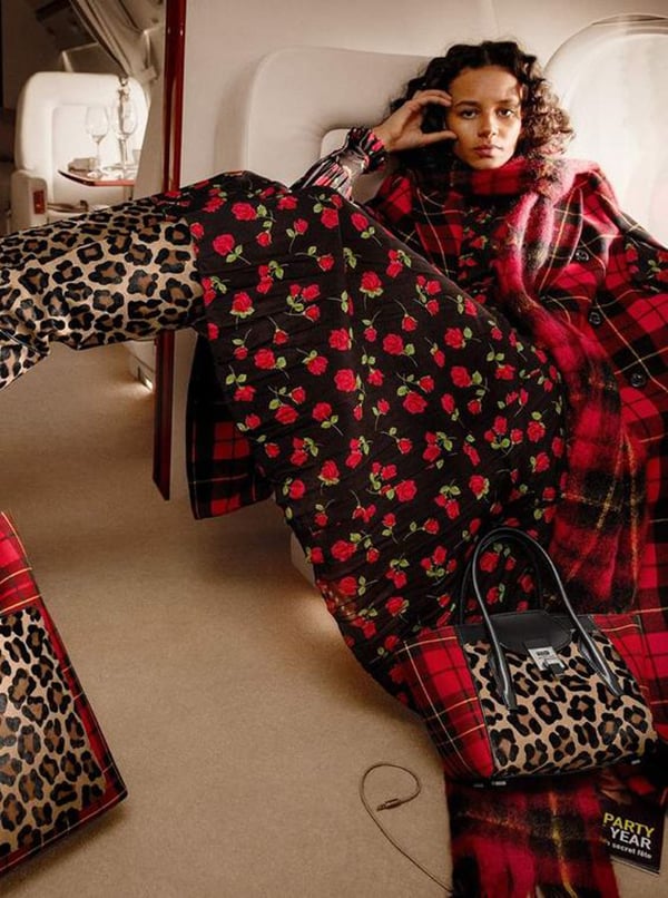
One of the joys of Winter is the wardrobe that comes with it! The layering of textures and garments and accessories – oh my! For those who think prints are best saved for Spring & Summer, think again! The layering and clashing of prints is perfectly suited to an outift where more is more.
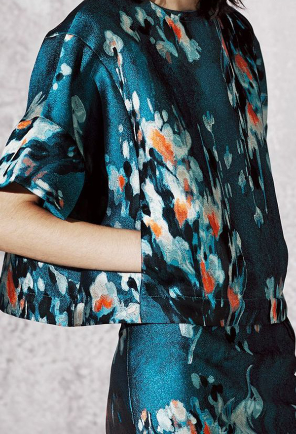
We thought we’d put the spotlight on a few of our Fabric Shop classics which are perfect textile designs to wear during the cooler months. What ties these designs together is their cool colour palette, a heavy focus on texture and their creation which relied on purely digital techniques and methods of manipulation. Introducing ‘Blue Fall’, ‘Brilliant Cactus’ and ‘The New Check’.
Blue Fall

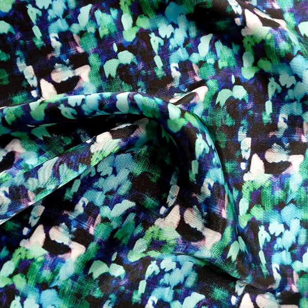
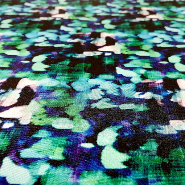
This dizzying haze of aqua, violet and jade features digital paint brush textures which create a print that feels like an abstract checkered design. We love this contemporary reinterpretation of a winter wardrobe staple.

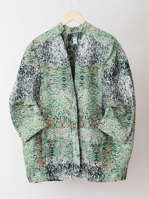
Brilliant Cactus

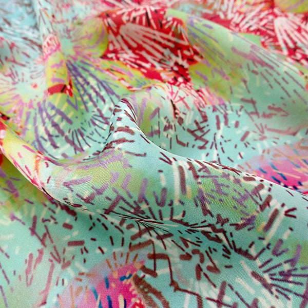
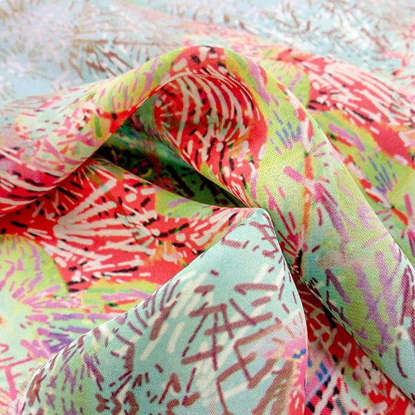
This graphic print pairs bright and neutral colours to create a design that is both bold and versatile. ‘Brilliant Cactus’ is bursting with energy and is a great example of a deconstructed floral print.

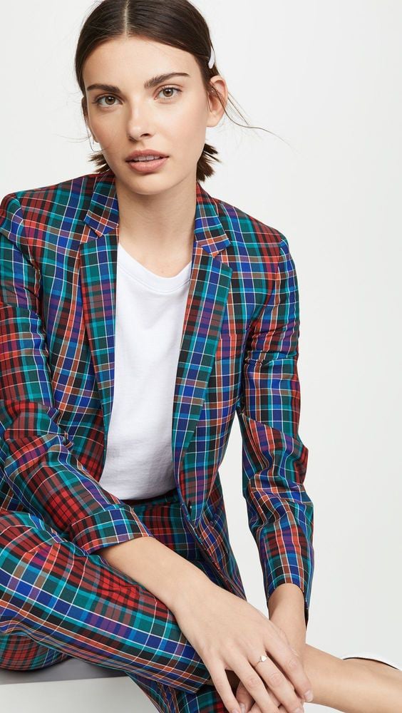
The New Check

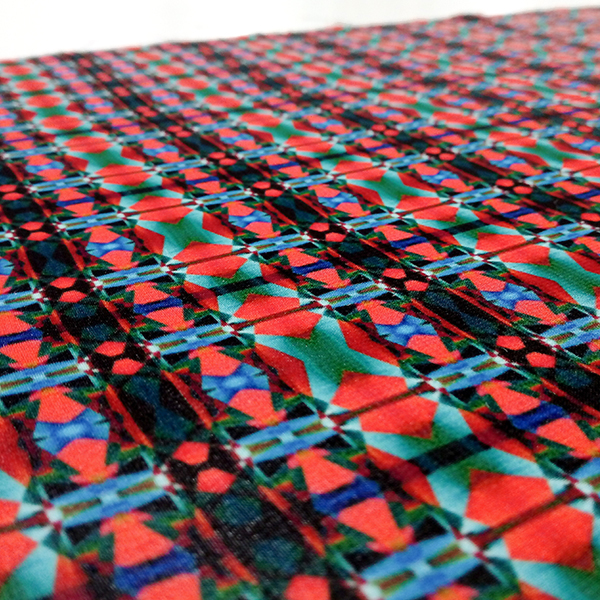
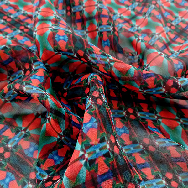
This geometric print puts a kaleidoscopic spin on a classic red tartan print. This design works well worn on its own, or if you’re feeling adventurous, take some style tips from Fran Fine and pair this with an animal print!

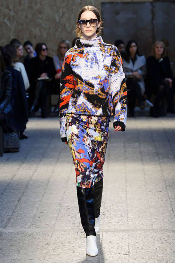
We’ve popped some inspiration below of similar design styles and print combinations!
 Image via Pinterest
 Image via Pinterest
 Image via Pinterest
 Image via Pinterest
 Image via Pinterest
 Image via Pinterest
We’d love to know what you think these designs, or any of the others in our Fabric Shop, would be perfect for – so get in touch!
Snippets. Chats with Creatives.
Here at Digital Fabrics we love everything print, pattern and colour and we love to know what makes print designers tick.
This series we are focusing on textile designers as our creatives to get into the nitty gritty of the thing we love the most, textiles and surface design! We have asked a different set of questions relative to this and as always we hope to inspire others by sharing snippets of these creative stories.
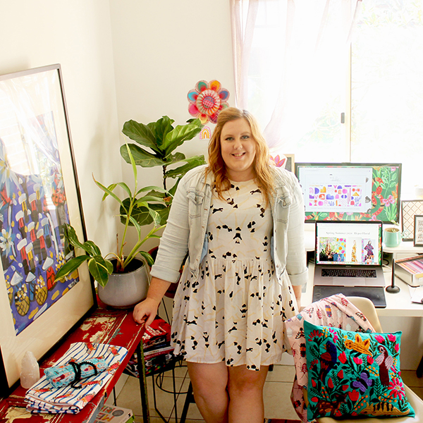
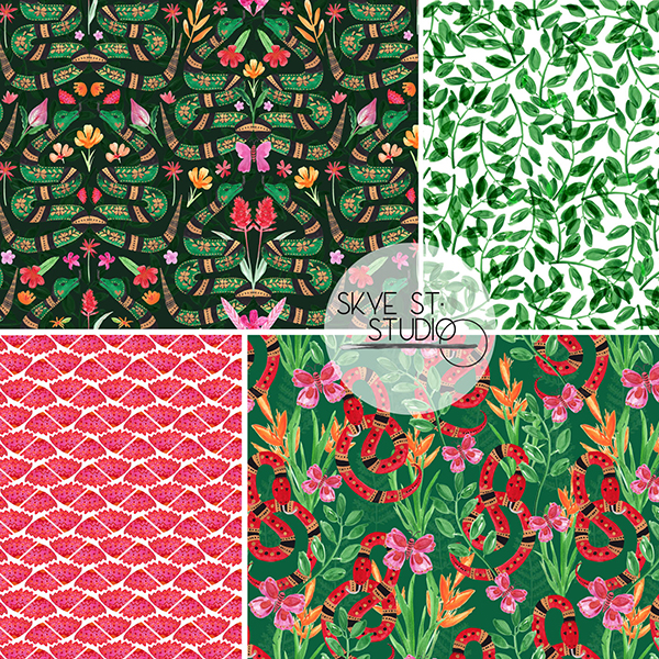
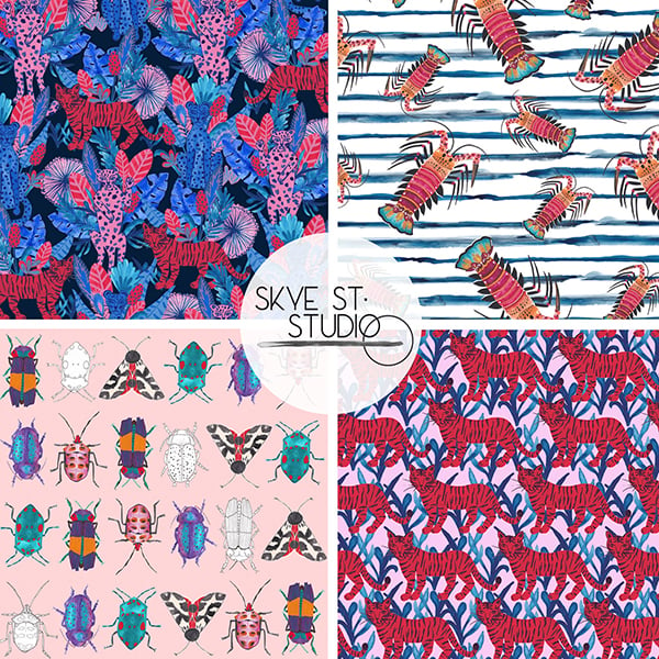
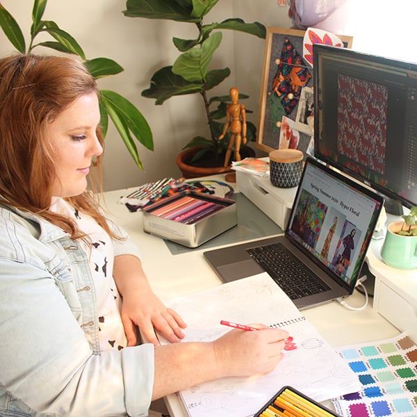
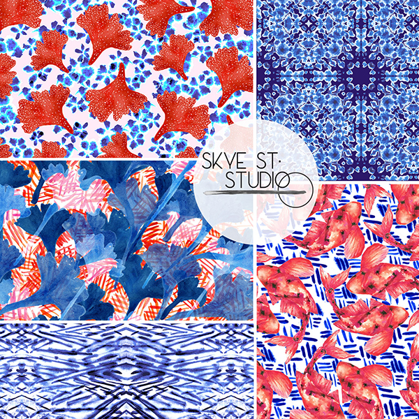
Today we are chatting to Crystal Kruger from Sydney based Textile studio ‘Skye St Studio‘ who offer a range of services such as textile design, colour matching, pattern grading and mood board creation. They have a range of fun, bright and often hand painted prints that you can license or buy exclusively for all sorts of projects and needs as well as offering custom illustrations and design work.
 Tell us a bit about yourself, your brand/label name what your creative practice is, how and when you began:
My name is Crystal Kruger and I am the designer behind Skye St. Studio. I am a textile and surface pattern designer and also a design educator. My career began straight out of school, studying fashion and textile design and technology education at the Whitehouse Institute of Design in Sydney. I have spent the last decade both teaching textiles and design subjects to students, as well as starting my own business as a textile designer. For me it has always been textiles or fashion in some form or another that fill my heart and fuel my inspiration. It took me a bit longer to realise the textile design was the right fit.
Where do you call home and what is your favourite thing about where you live?
I live in Sydney, Australia which is such an exciting, vibrant and inspiring place to be. Everything is fast paced but there is a wonderful balance between the urban and natural landscapes. I love being able to explore the ocean, the rivers and the mountains which surround Sydney but then also experience the wonderful, eclectic mix of cultures (and foods!) that inhabit this place. Culture, travel and nature are some of my biggest inspirations.
What 3 words best describe your creative style.
Colourful, painterly and fun! Trend-driven designs with soul.

 Tell us a bit about what kind of studio, space or practice you run? Do you sell online or license your prints, do you do commissions or lots of freelance and what do you like doing the most?
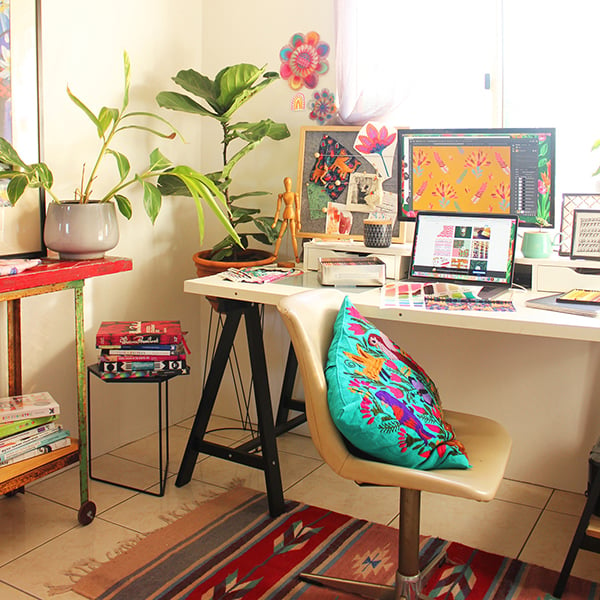
Skye St. Studio is a very flexible design studio. Because it is so small I can be agile and accommodating to the needs of different clients. I sell the copyright to textile and surface pattern designs outright, as well as licensing prints through the catalogue on my website. At Skye St. Studio, I often work with local makers and other small businesses, but also larger companies and I love the variety that comes from working with different creative businesses. I do commission based pattern design and have worked with clients to design a range of other products including logos, tote bags layouts, soft toys and bespoke wall art for giftware. Skye St. Studio offers freelance design services as well and I would love to build that side of my business further. I also have an exclusive collection of designs available through Pattern Observer Studio. These are shown at trade shows such as Premiere Vision and Surtex but are also available for viewing at any time through Pattern Observer.
 Do you have a favourite medium and/or method to work with, if so what is it and why?
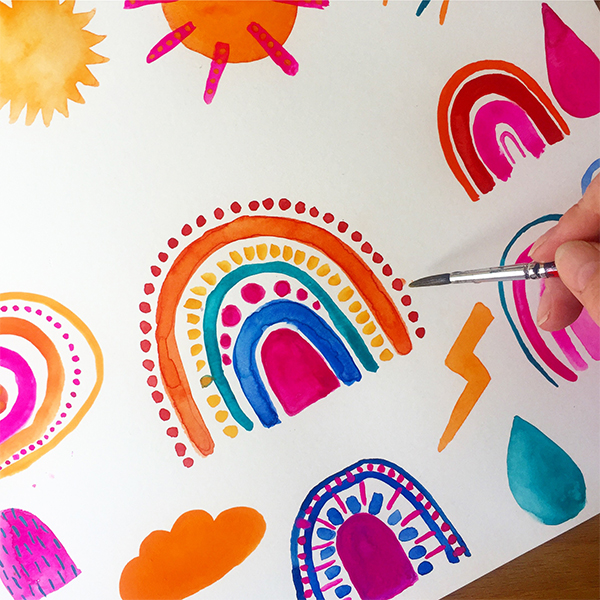
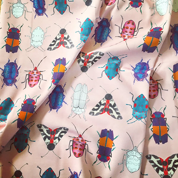
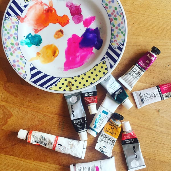
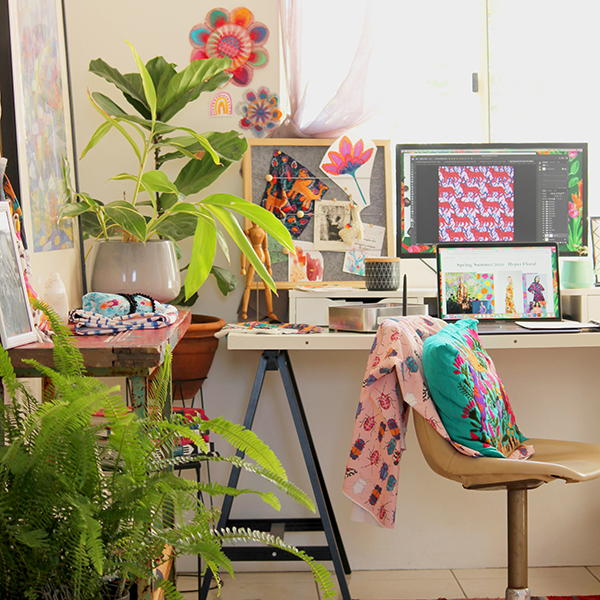
My favourite way to design Skye St. Studio prints is to paint. I love to put some music on, something like The National and let the creativity flow. Sometimes I will just paint freehand, other times I will sketch first. I love to use gouache paints mostly, but also ink and watercolours. Not all Skye St. Studio prints are painted, but all are hand-illustrated before they are digitised. Colour is quite intuitive for me and so I tend to pick my palette right at the start of a project. I usually work with inspiration images in front of me, such as a Pinterest board I have created, a mood board I put together, or reference images from a client brief. I love the subtle variations of colour and texture that paint allows me to capture in my prints. I really feel this adds life and soul to my prints.

Which part of the creative process is your favourite and why?
Well, I love all of the creative process! But I must say, there is nothing like getting your hands on a new design brief or a new idea. I love that inspiration and idea development phase, putting together a mood board and sourcing amazing imagery. In that moment I love the sense of purpose, drive and that excited feeling in my stomach. I love the potential of that stage and the intuitiveness of being inspired. I feel that this is a real strength of mine as a designer, I am very good at synthesising the mood of a brief and bringing ideas together.
 What would you say is the biggest challenge when running your own business, what is your favourite and least favourite part?
The biggest challenge is the potential for isolation. As a designer we can get some absorbed in our thoughts and be in our heads too much. But also as a small business, it is easy to forget that other designers just like us are struggling with the same business challenges. It is really important to try and build a network of people that you can chat with and share your journey with. Often you are working from home or in a studio on your own and it can be a bit lonely at times. I love having someone else around to just ask, ‘what do you think of this?’ Otherwise it is so easy to overthink things! Finding the right clients can sometimes be a challenge as well, being a small business.
The best part is the creative freedom and the satisfaction I get from fulfilling my creative goals. When you have a win, it is amazing! I love it when a client gives me great feedback and I see them getting excited like I am about a print I am working on. That validation is amazing as a designer. It is wonderful working for myself, because I can choose what and who I want to work with as well. After the restrictions of working in schools for many years, I love the flexibility of being able to work from my studio or a cafe, to set my own schedule and to dress like me!

What would your dream creative project or collaboration look like? Tell us about why you would love to collaborate with them and what you find inspiring about their work.
My dream project would be to have my own print-driven, body positive clothing range. My background is in fashion and I have always approached clothing as a form of expression. Prints say so much about the wearer, which I love! Yes, trends come and go, but if you can find pieces for your wardrobe that really sing and show the world who you are, then that is a wonderful thing. I feel it is especially hard to find fashion like this for women size 14 and up. Your options become so limited and I think everyone deserves to be able to buy clothes they love, no matter your size.

 What projects or collaborations from last year stuck out, good or bad and what is coming up over this year that you would like to plug!
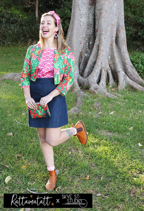
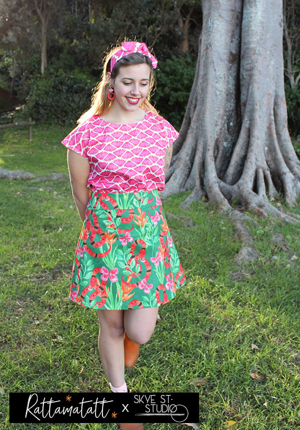
I have a brand new collab which is launching right now and I am super excited about it. I recently worked with fashion designer Kathryn Shaw of Rattamatatt on her new spring collection called Jungle Fever, which is available for preorders on Etsy from 5th August. She has featured Skye St. Studio hand painted patterns from my Jungle Snakes print collection on her garments and it all looks so amazing! Kathryn has been a dream to work with and I am so proud of what we have created – we hope you all love it too!
All of Rattamatatt’s designs are classic and vintage cuts with a focus on fit and they all feature gorgeous, fun, modern prints with personality. Kathryn is all about slow fashion and ethical clothing production, making everything herself. I love this design philosophy and she has made my prints look absolutely fantastic on her garments! With Rattamatatt’s silhouettes and Skye St. Studio prints, the Jungle Fever collection is fun, bright and whimsical – check it out online! Stay tuned to our social media accounts also, as there may just be a fun little giveaway in the works, where you can score yourself some original Ratamatatt x Skye St. Studio goodness! Jungle Fever Collection available for preorder on 5th August 2019 at Rattamatatt’s Etsy store.


Where would you like to see your work featured?
One day I would love to see my work adorning some amazing dress in Vogue or for sale in Gorman! I am obsessed with their artist collabs haha.

 You can find what Crystal is upto here: Website, Instagram, Facebook.
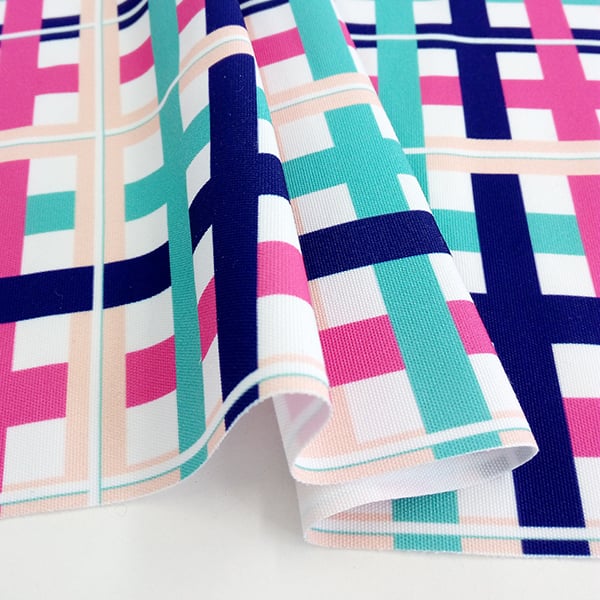
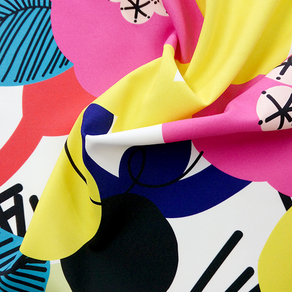
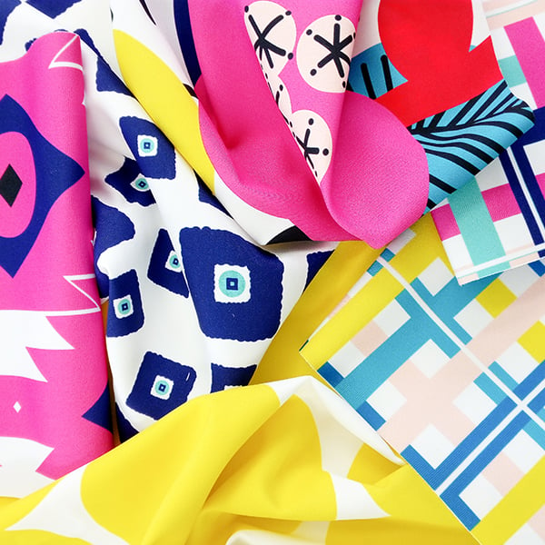
Back in 2016 we worked with designer Elba Valerde from Live Colorful to create a range of prints for our Fabric Shop which perfectly encapsulated her fun and vibrant style. We thought the change in season made for the perfect time to revisit one of our brightest collections; the Live Colorful Collection, and hopefully inspire some creative DIY projects for the Winter months!


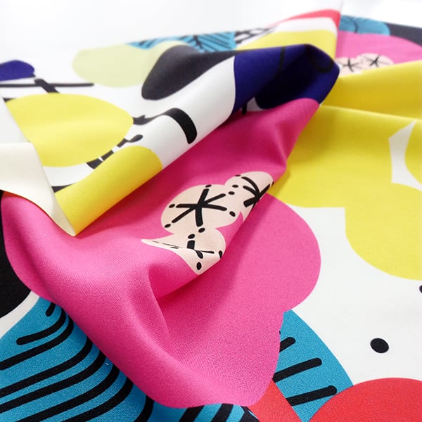
The Live Colorful range has been inspired by the beauty found in nature. Floral and botanic shapes have been photographed, studied and doodled, translating intricate forms into minimal, playful shapes.


Selecting a vibrant yet restricted colour palette was also essential to creating these designs. The use of primary colours, white and hot pink, give this range a carefree feel. The chosen colours paired with simplistic shapes results in a collection that is both timeless and fun, with a touch of Scandi textile flair.


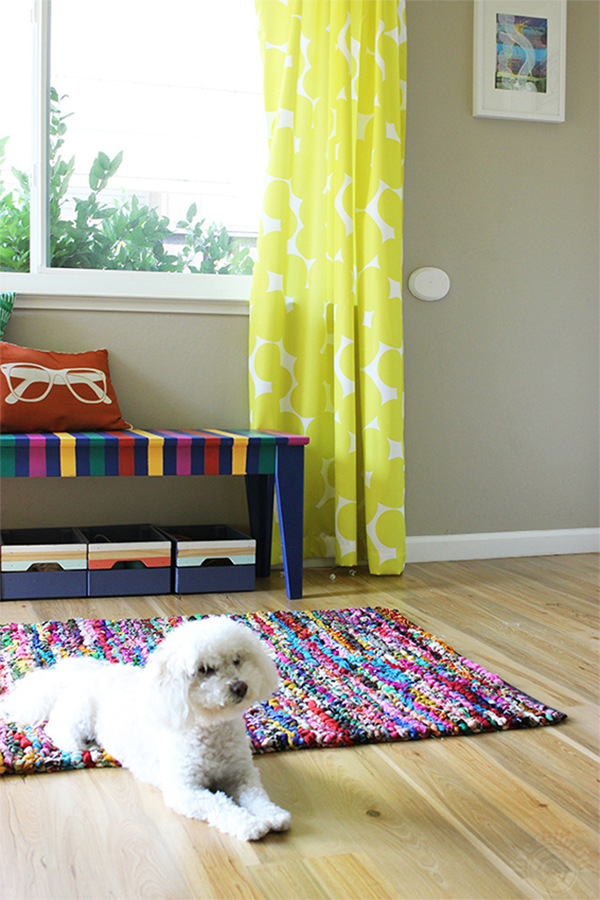
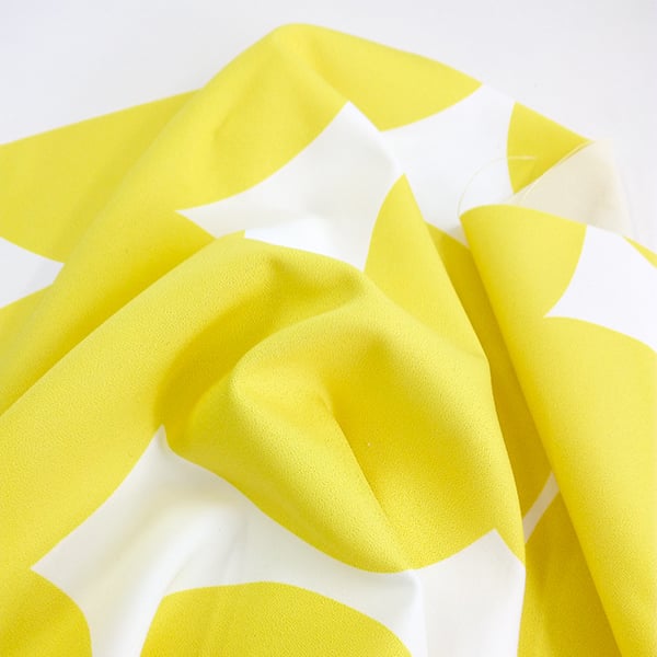
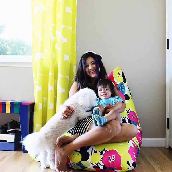
The Live Colorful Collection can be used for cushion covers, tablecloths, table runners, napkins and curtains, just to name a few. Check out our DIY resources for both curtains and bean bag covers using these designs for more inspiration!


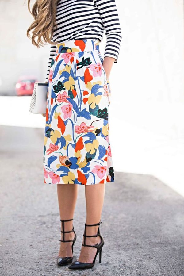
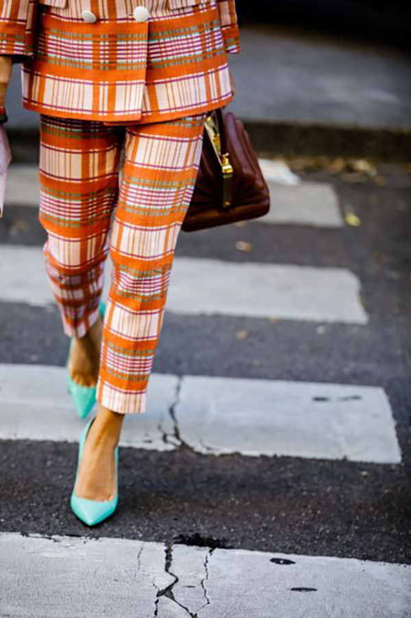
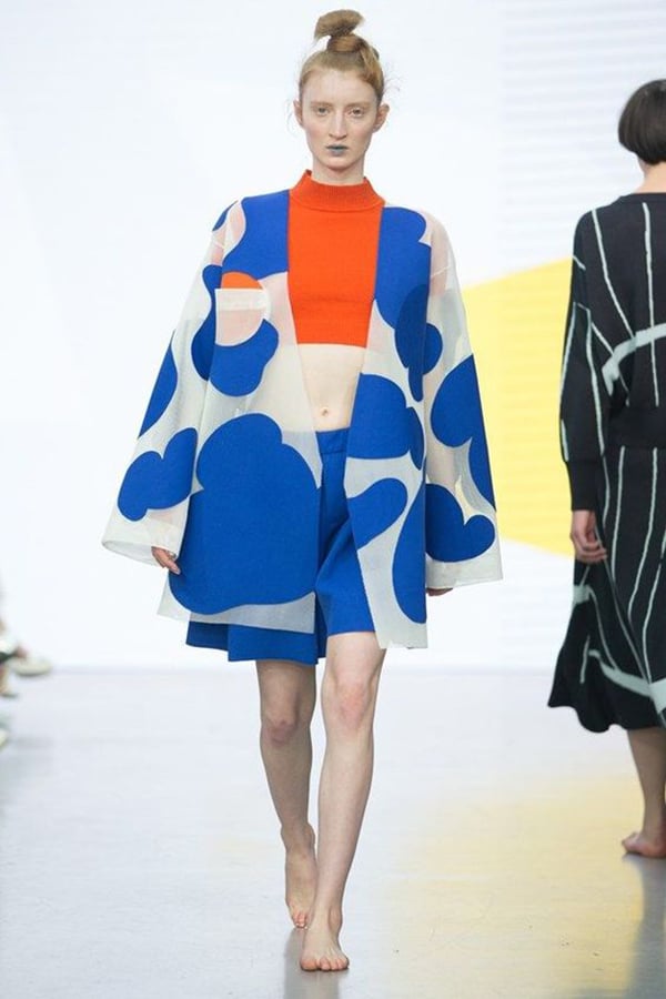
Whilst the range was originally designed with homewares in mind we’ve found this bold style of design is perfect for fashion applications as well! We’ve included some images below of similar prints to show you how they can be used in your wardrobe!

Image via Pinterest

Image via Pinterest
 Image via Pinterest

Image via Pinterest
We’d love to know what you think of the Live Colorful Collection, so get in touch!

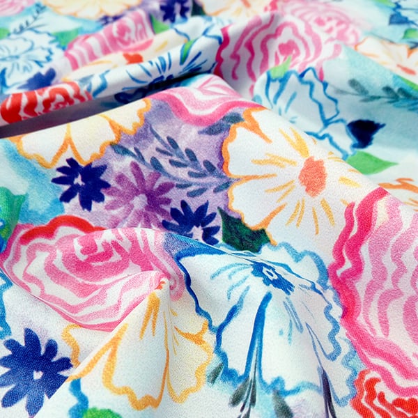
It’s that time again – our design team has been busy working to deliver new range of textile designs for our Fabric Shop that delight and inspire. Having focused solely on digital methods to create designs for our previous launch we’ve returned to hand-drawn and hand-painted motifs, texture and line for our latest range. Introducing our Wildflower Collection.


Once again we found ourselves being inspired by nature. It’s hard not to be when it still feels like Summer in Sydney. Our research began by collecting imagery of picture perfect gardens and the creatures that lie within them. These were then used to start drawing and painting interesting forms and surfaces.


From the variety of motifs drawn, a selection of watercolour elements were chosen to develop further for the range, with detail rich designs being an area of focus. We wanted to create a range of prints where the designs could work on their own as well as complement each other when used together. By choosing the unifying feature of watercolour motifs across the range we knew we could be experimental with colour and still create a balanced and harmonious collection.


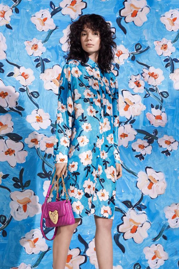
The Wildflower Collection plays with primary colours throughout the designs, with warm and cool variations of reds, yellows and blues being seen throughout. This balancing of undertones and vibrant colours results in a fun range of designs perfect for those who love to make a statement by mixing and matching bold prints together. We’ve included some reference imagery below that show not only designs comparable to those in this collection, but also those that celebrate the art of clashing prints.
 image via Pinterest
 image via Pinterest
 image via Pinterest
 image via Pinterest
 image via Pinterest
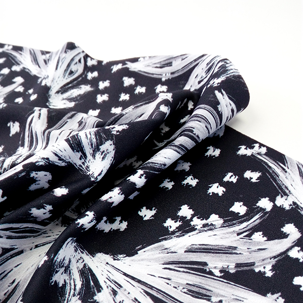
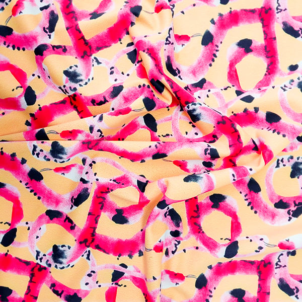
The Wildflower Collection is full of dramatic colours, textural hand-drawn elements and motifs that feel both ‘naughty and nice’. Whilst ‘Viper Sun’ and ‘Tea Party’ are best suited for fashion rather than homewares, ‘Eclipse’ and ‘Zephyr’ can definitely work well for both. We’d love to know what sort of applications you think these designs would be perfect for – so get in touch! Designs are available in our Fabric Shop now.

Recently when we’ve launched a new range of prints we’ve taken the time to put together a blog post that details the creative process behind the collection. We thought it would be a fabulous opportunity to revisit some of the past textile collections in our Fabric Shop and share the inspiration, techniques and methods that went into the creation of these designs. For this textile retrospective we’re focusing on one of our most popular ranges – The Luxe Collection. The range features 6 key designs, with some available in multiple colourways, resulting in a rich 10 piece collection.
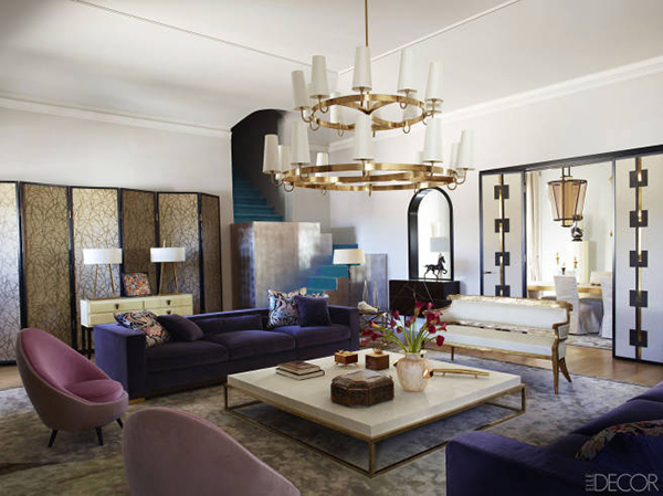
 Palazzo Colonna Rome – nikyrovis.com.au
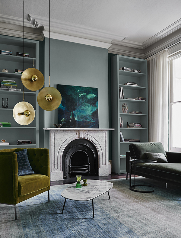
 Dulux Styling – we-are-scout.com
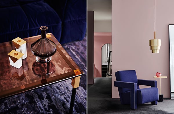
 Dulux Styling – we-are-scout.com
 Villandry Wallpaper Styling – stylelibrary.com
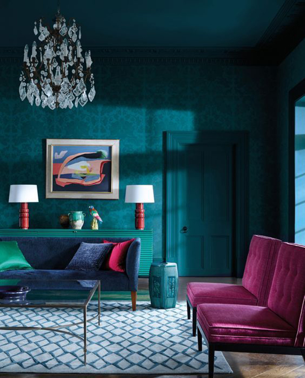
The Luxe Collection wanted to celebrate the essential role that textiles and prints play in designing really sumptuous interiors. The layering of different colours and textures together elevates a space and gives it that luxurious feel. Our design team wanted to apply this same logic to a textile collection by playing around with different colours, techniques and imagery.


The first design element we worked on was colour. We wanted to select a colour palette that created a sense of opulence all on its own. The secondary colours of green and purple were selected as focal points, with distinct choices for each being used, including hot pink, sage green, indigo and spearmint. The colour palette has cool undertones throughout and is reminiscent of gem stones.


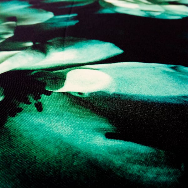
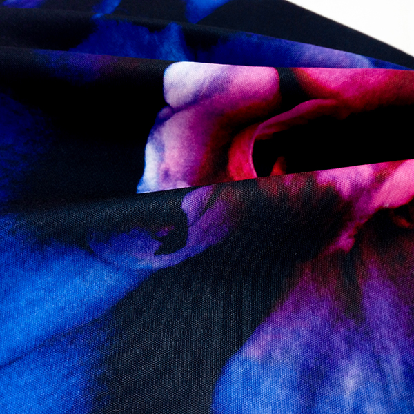
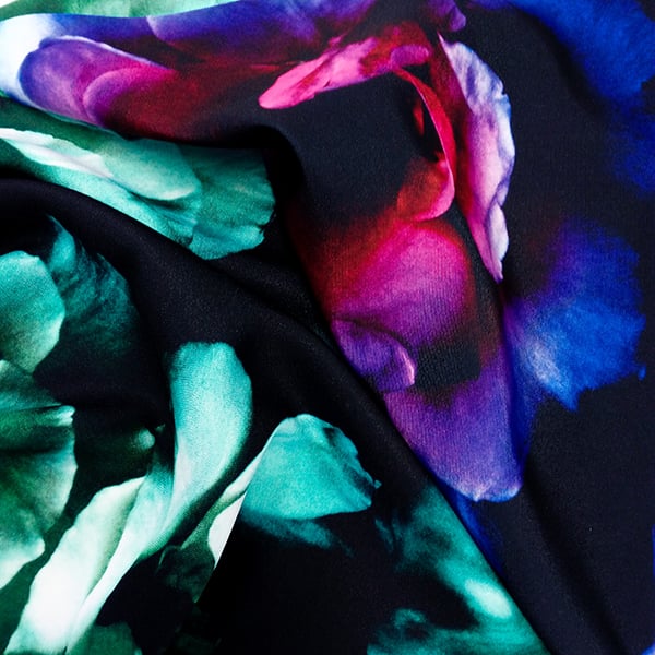
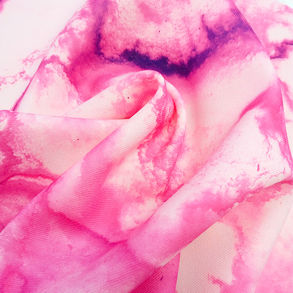
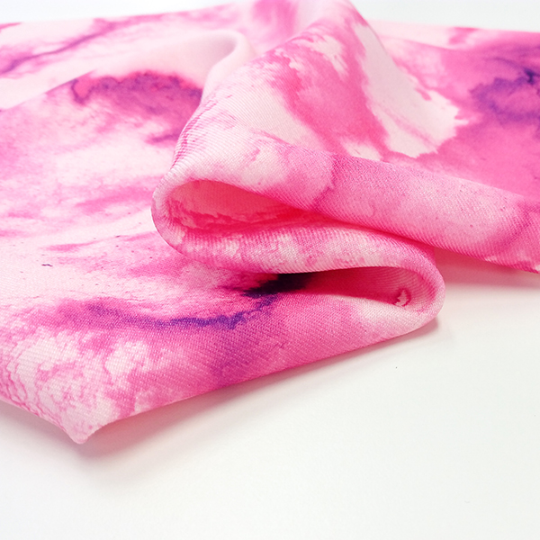
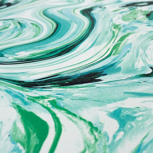
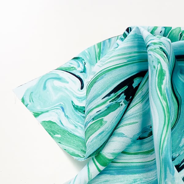
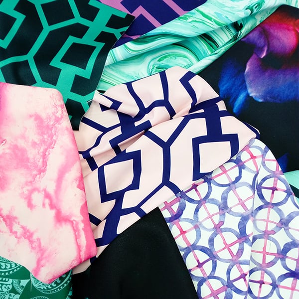
The creative process then varied for each of the designs. For the ‘Bold Rose’ prints, photographs taken at The Royal Botanic Garden were digitally manipulated to create moody large scale prints. The ‘Watercolour Pink’ and ‘Circular Peony’ were created from hand drawn watercolour illustrations which gives the designs a free-flowing aesthetic. ‘Mramor Ice’ was created using marbling techniques, which also provides an organic feel, whilst ‘Elephant Ear’ and the ‘Cutout’ prints were designed entirely digitally as a point of difference within the range.


This variation between designs creates a really interesting narrative throughout the collection where the prints can either work alone or harmonise beautifully together. The Luxe Collection is a series of statement prints certain to give any space a touch of flair.


We’d love to know what sort of project you would like to use these designs for, or perhaps the projects you’ve already used them for – so please get in touch! Designs are available in our Fabric Shop now.

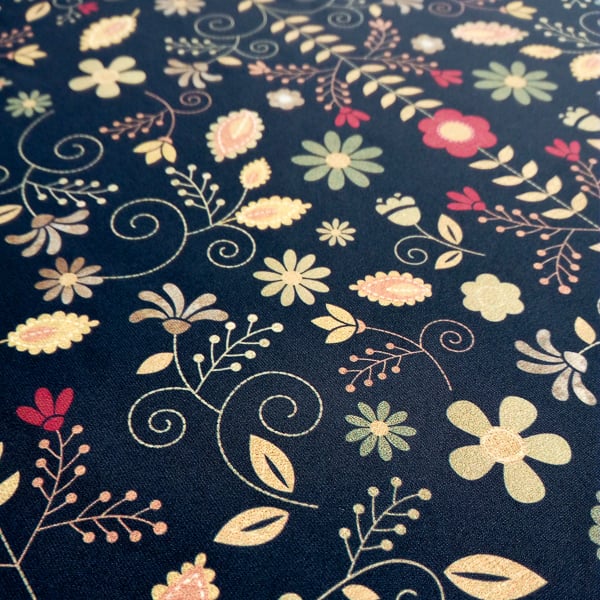
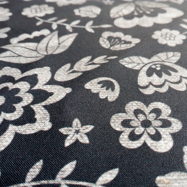
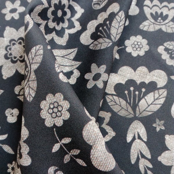
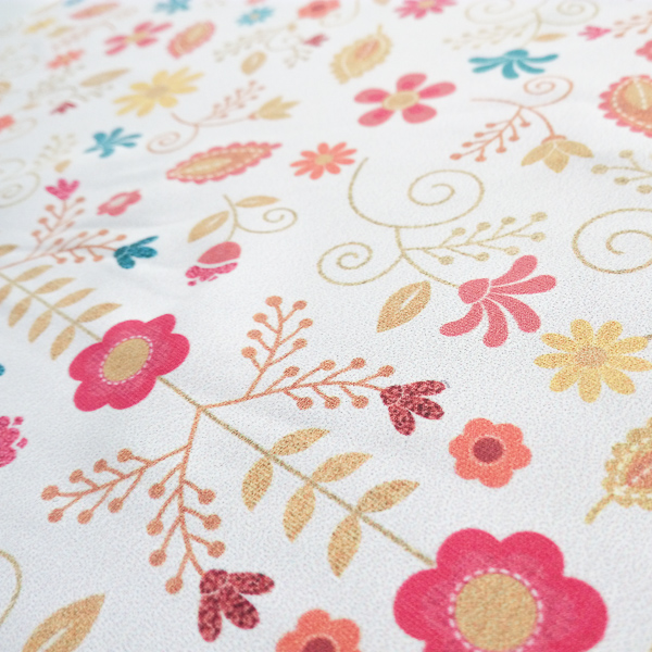
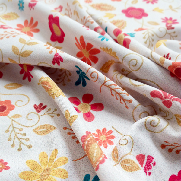
We had so much fun creating our last collection we thought we’d release another range of beautiful fabric prints dedicated to florals. This time round we completely changed our creative process to deliver fabric prints that felt entirely different to the soft, inky designs of the Palamporia Collection. Introducing our new Folk Flora range, which is available now in our Fabric Shop.


To make sure we were creating floral motifs that felt new we put the watercolours away! This time we wanted to focus on the textures and line work that could be achieved by working digitally only. This does unfortunately mean that we don’t have any gorgeous process illustrations to share, however we think the end results are stunning enough!


We began by collecting images of flowers to draw from, as well as endless scans and photographs we’d gathered of interesting textures. We drew our floral motifs digitally, giving them crisp sharp lines and overtly simplified shapes reminiscent of retro floral forms.


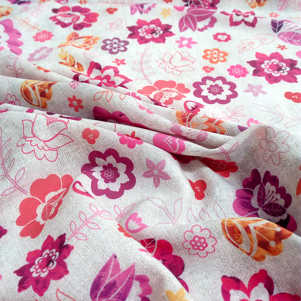
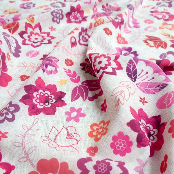
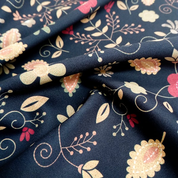
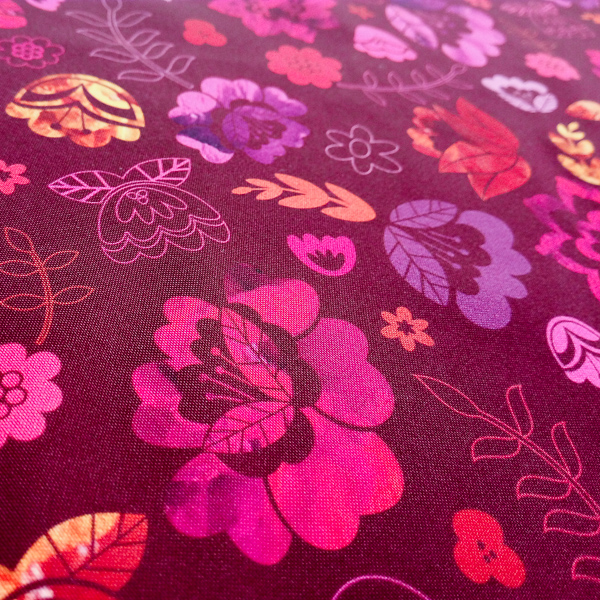
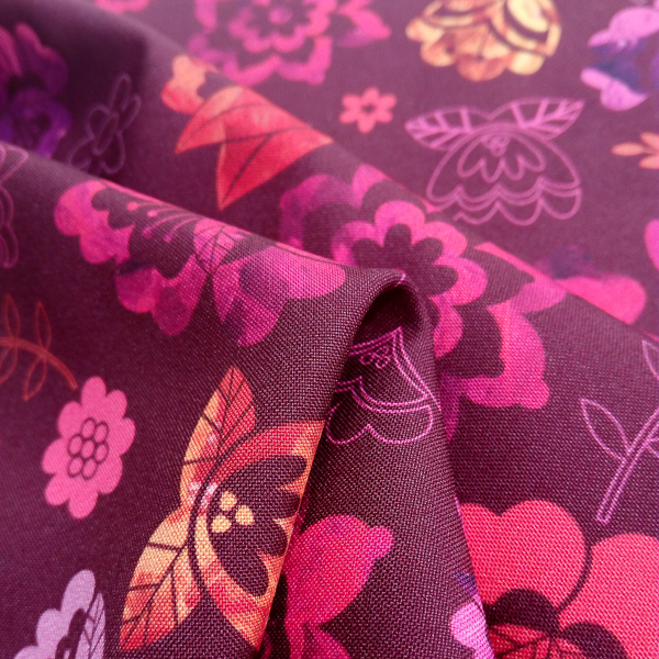
We then began to play with our gallery of photographs and scans. These images were manipulated, distorted and layered to come up with interesting designs to use to fill our floral motifs. Some designs, such as ‘Kaleidoscope Garden’, layer several of these digital textures to create a really rich patchwork, whilst others like ‘Stormy Blossom’ choose to showcase just one gorgeous texture. The strictly digital process of drawing, cutting and collaging resulted in designs that had a vintage flair, so accordingly we chose a warm colour palette that reflected this outcome.


With so many of our prints starting with hand-drawn elements it was refreshing to try a whole new process with a different set of restrictions and possibilities. The Folk Flora Collection creates retro feeling designs for the digital age, and can work for both fashion and interiors applications.


We’d love to know what sort of project you think this range would be perfect for – so get in touch! Designs are available in our Fabric Shop now.
