Colour.
We do our fair share of colour matching here at Digital fabrics, Clients either mail us colour samples or give us Pantone PMS colours to work off. Colour is a big deal in the printing world; a logo must be printing in the same colour every time to be consistent with the company image. Colour has become more and more important to companies, some of who trademark their signature colour-think tiffany and Christian Louboutin.
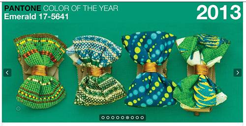
This year pantone released its colour of the year which was Emerald, this is not to say that everyone will be making things Emerald; it’s just a colour Pantone chooses to represent the year.
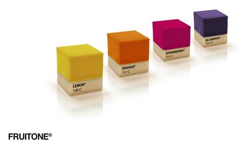
In further research on the topic colour, Pantone colours have been popping up in various other industries.For one delicious industry it has appeared in the form of cakes, confectionery artisans Miguel Angel Señorís and Manolo Angresola along with designer Ana Yago, creative director of Sanserif Creatius, are the ones to thank for these aesthetically pleasing, outfit matching works of edible art.
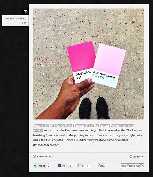
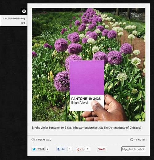
Another Pantone related article that has also caught my eye is the Pantone Project by Photographer Paul Octavious; Octavious has set out on a mission to match Pantone colours to things we find in everyday life. In a project he is updating on Tumblr, we are taken into Octavious’ surroundings and shown that colour is everywhere.
If you are in need of colour matching, contact us through our website.
Images from http://www.swide.com, http://pauloctavious.tumblr.com/, http://au.pantone.com/pages/index.aspx?pg=21055


